Background
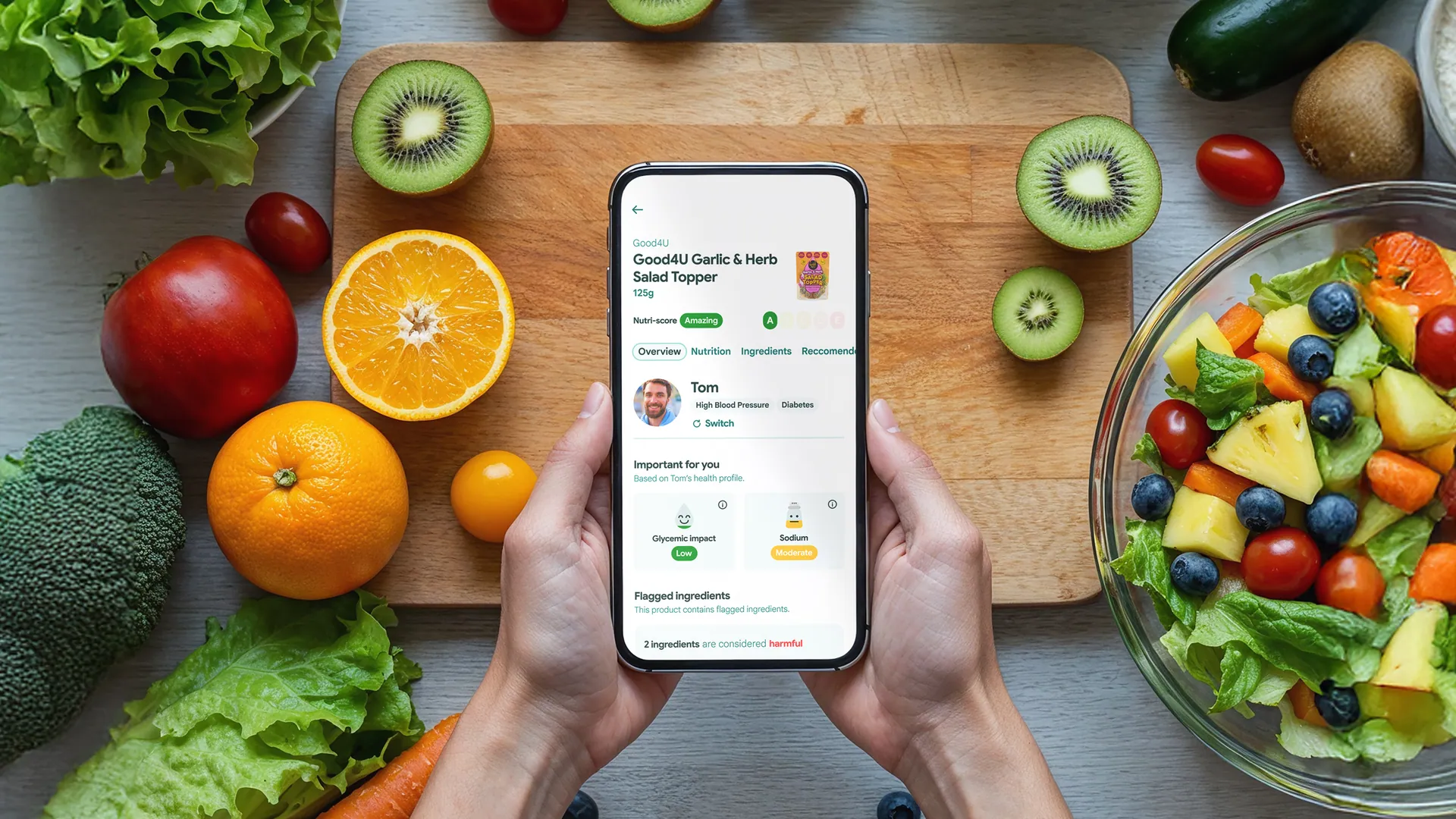
Bite Insight started with a simple frustration: food labels are dense, inconsistent and hard to interpret, and most of us give up and buy the thing anyway. I wanted to see whether design could fix that. Scan a product, get a clear answer about what’s really in it, decide with confidence.
It’s a personal product exploration, and I took it from the first rough idea through to an MVP-level experience: product thinking, UX and interface design, all of it mine.
The work
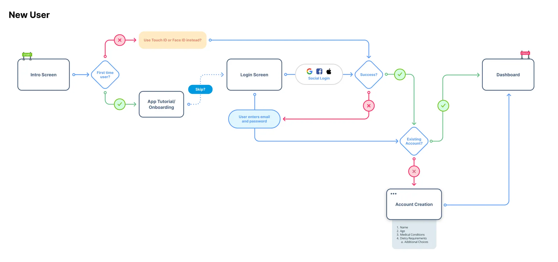
The hard problem was the balance between accuracy and simplicity. Nutritional data is genuinely complex. Oversimplify it and people stop trusting you; show everything and they stop reading. My answer was hierarchy: surface the insight that matters first, and keep the deeper detail one tap away for anyone who wants it.
I designed against real situations rather than idealised ones. Scanning one-handed with a basket in the other hand. Comparing two products in a supermarket aisle while a toddler loses patience. That’s why the interface leans so heavily on consistent, repeated patterns; unfamiliar information lands better inside familiar shapes.
The result
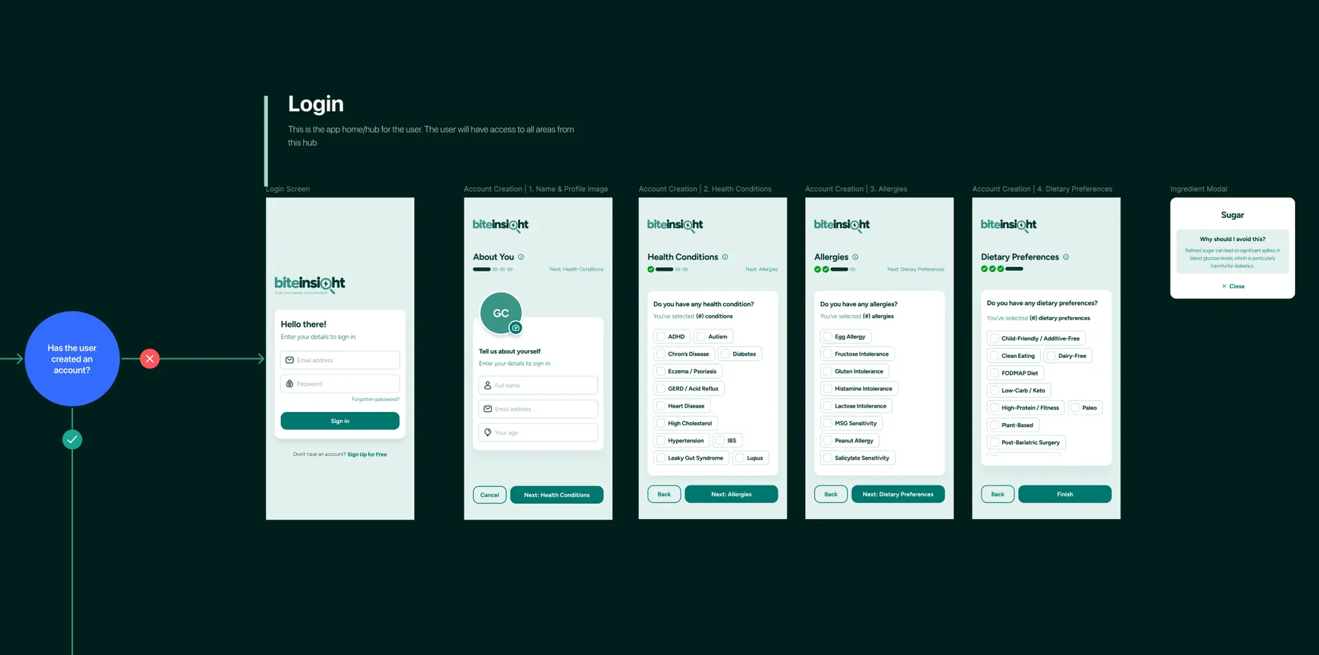
The finished concept shows how much friction good UX can remove from an everyday decision. It also sharpened my respect for information hierarchy and careful language when the raw material is complicated data. End to end, from problem definition to interface and system, it’s some of the product work I’m most at home in.
You can learn more at biteinsight.co.uk.