Background
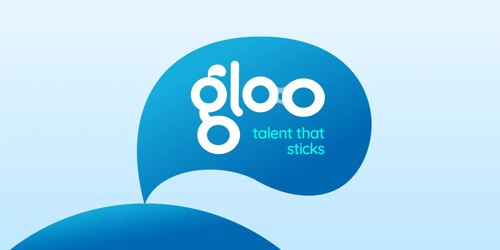
Richard from Gloo Digital Recruitment asked me for a sharp, contemporary logo for his new venture. Recruitment is a crowded market, so the real task was finding what made Gloo different and getting that into the identity.
The answer was in the name. I designed custom, hand-crafted typography where neighbouring letters subtly connect, so the wordmark itself behaves like glue. It also gave me the tagline: “talent that sticks.”
The work
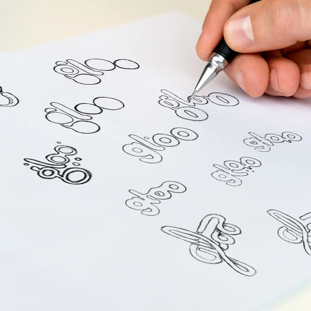
I started in Procreate, sketching by hand rather than reaching straight for vectors. That looseness matters at the exploration stage; it keeps the typography playful instead of safe. The sketching produced a pile of concepts, and one stood out for its legibility and integrity.
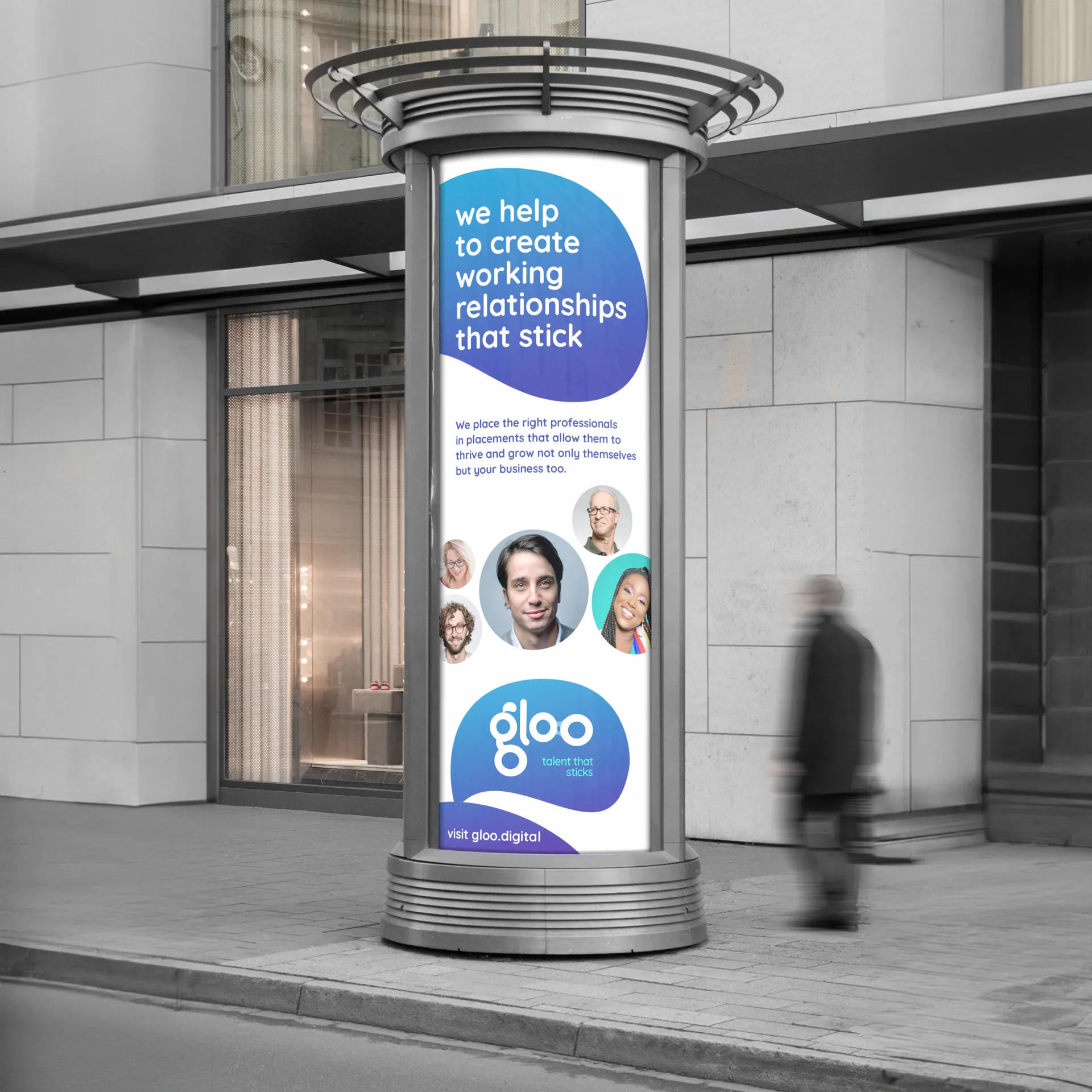
Then I pushed it further, adding fine adhesive strands between letterforms for a sense of viscosity and movement. With the mark settled, I worked through how it would live in the real world: marketing materials, corporate stationery, promotional products.
The result
The logo landed better than either of us expected. It’s now everywhere Gloo shows up: social channels, the website, printed materials.
Working this hand-crafted was a treat, and there’s a particular satisfaction in watching a mark you drew by hand out living its life in the real world.