Background
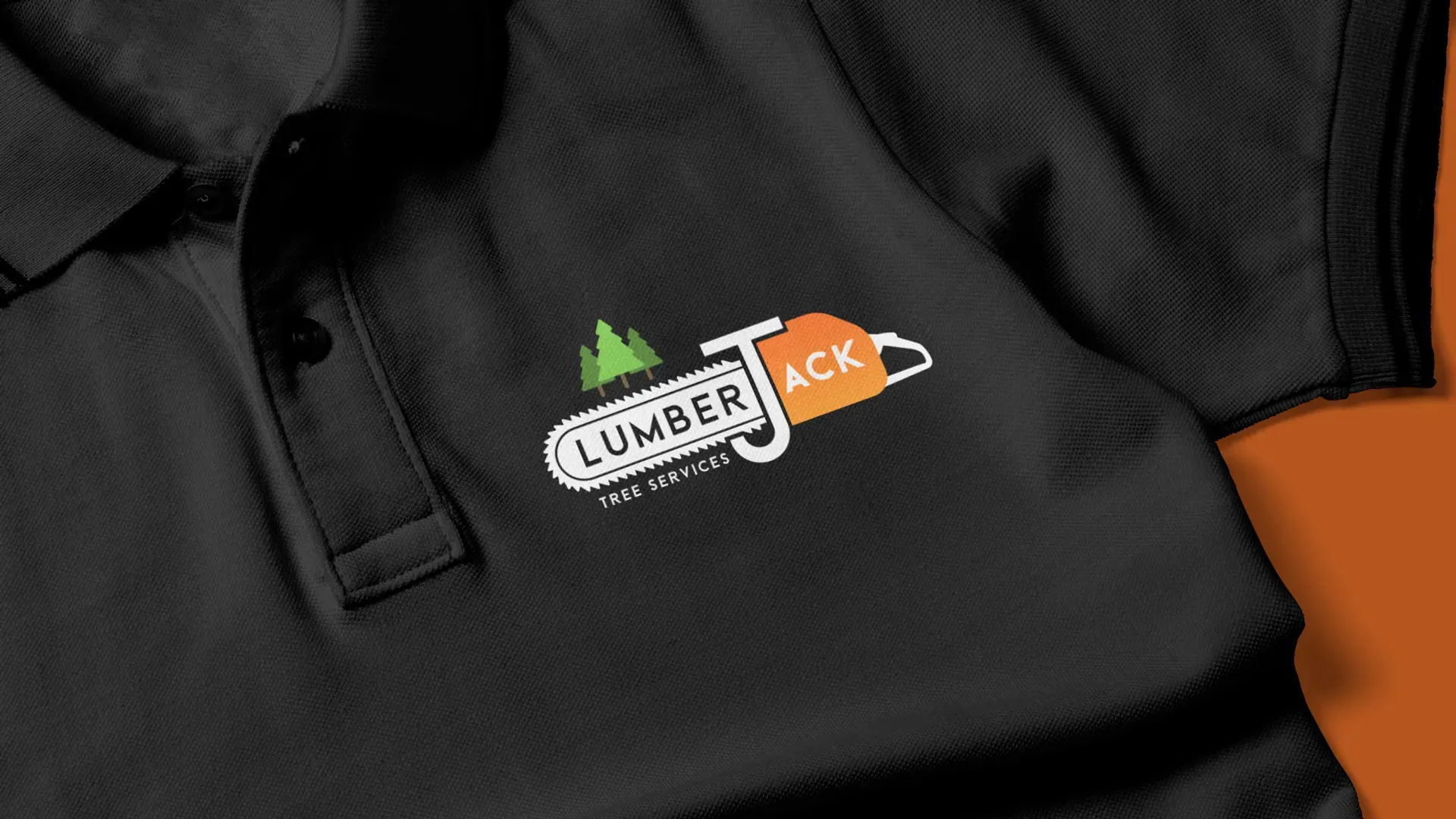
Jack asked me to refresh the logo and branding for LumberJack UK Tree Services. The company was young but already building a reputation on the quality of Jack’s work, and the brand needed to catch up with it. He wanted an identity confident enough to go on staff uniforms, vehicle livery and social media without looking like it came from a template.
The work
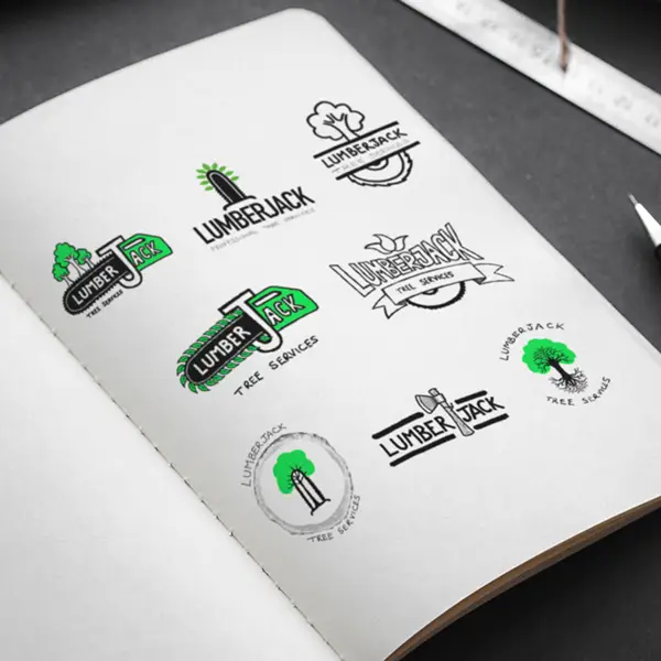
The name LumberJack is a gift, and my job was to build a brand that deserved it. I explored the kit Jack uses every day: chainsaws, axes, climbing gear, along with trees and leaves from the natural side of the work. The idea that stuck was the chainsaw as the central motif, with its handle adapted to form the J in LumberJack. Distinctive, relevant to the trade, and hard to forget once you’ve seen it.
The result
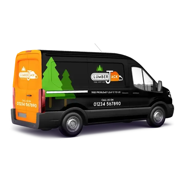
The final logo has real presence. Vibrant orange against dark grey, with light green and white to balance it: a palette that feels professional and properly workman-like. It translated cleanly onto uniforms and vehicle graphics, and I animated the logo as a video intro for Jack’s YouTube channel, so the brand shows up the same way everywhere his customers find him.