UI/UX design
Background
Fastic’s dashboard needed to do a better job of surfacing the information users cared about most, while feeling more personal, focused and useful day to day. The opportunity was to evolve the experience without creating something that felt disconnected from the rest of the product.
What was the challenge?
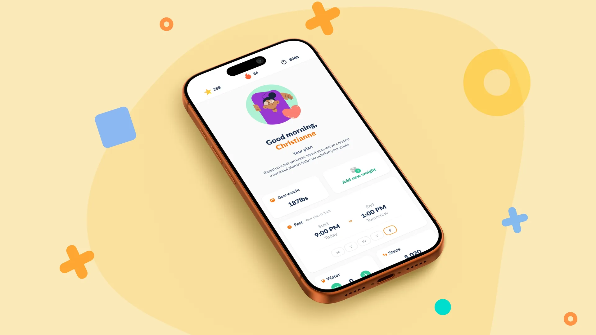
The existing dashboard was relatively basic and didn’t place enough emphasis on the goals and progress that mattered most to users. We wanted to create a clearer starting point for the app, bringing fasting progress, weight goals, water intake, steps, streaks and learning content together in a way that felt easy to understand at a glance. The challenge was to add more relevance and personalisation without overcrowding the interface.
What informed the direction?
The UX and research teams carried out user interviews, card sorting and wider research to understand what people expected from the dashboard. I worked with the team to translate those findings into a practical interface, using the research brief to establish the hierarchy and structure of the experience. Rather than introducing an entirely new visual language, we also chose to retain Fastic’s existing colour palette, typography and brand identity so the work could be introduced incrementally.
The work
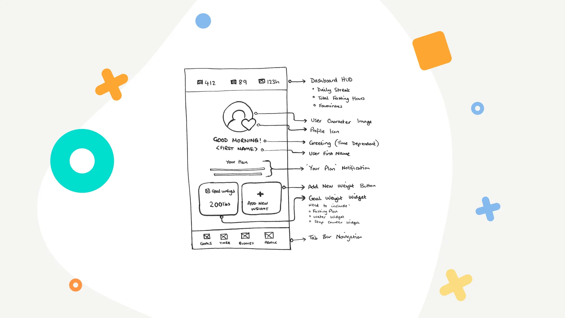
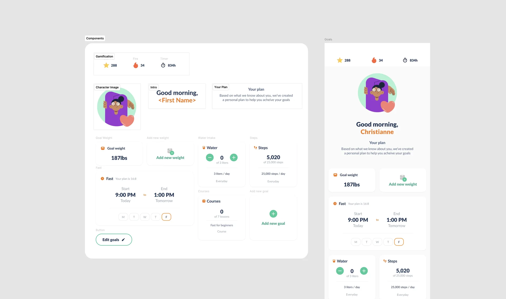
I translated the research into an initial dashboard wireframe before developing the final interface in Figma. The dashboard was designed as a flexible, component-based experience that could adapt around different users, goals and priorities.
What was my approach?
I started by taking the research findings and product requirements and turning them into a clear information hierarchy. The dashboard needed to answer a simple question quickly: what matters to me today? That meant prioritising goals, progress and achievements while keeping the overall experience light and easy to scan. From there, I moved into the visual design, working closely with product owners and UX designers to refine the experience.
What did I design?
I created the dashboard structure, wireframe and final UI, then built the individual cards as reusable Figma components. These components included the different areas of a user’s experience, such as: • fasting progress • goal weight • water intake • steps • streaks • courses and learning content The interface also incorporated Fastic’s existing illustration style and branding to make the experience feel more approachable and personal.
What were the key considerations?
Personalisation and scalability were closely linked. Because different users could have different goals and priorities, the dashboard couldn’t rely on a rigid layout. The individual cards needed to work as reusable modules that could be reordered or adapted while maintaining a consistent visual hierarchy. Accessibility was another important consideration. We needed to ensure typography could scale without causing the cards to become overcrowded or the interface to break down visually. As Fastic was a mobile-only product, the designs were also validated directly on representative iPhone and Samsung devices using Figma Mirror.
The result
The new dashboard was adopted and shipped quickly, helped by the simplicity of the UI and the reusable component structure. Because it stayed closely aligned with Fastic’s existing brand, the team could introduce the improvements without waiting for a wider redesign of the entire application.
What was the outcome?
The redesigned dashboard created a more focused and personalised starting point for users, giving greater prominence to their goals, progress and achievements. The simplicity of the component structure also made the design straightforward to review, hand over and implement, resulting in a fast design-to-development process and a clean sign-off.
What did this enable?
The work demonstrated that the product could evolve incrementally. Rather than holding improvements back until every area of the app had been redesigned, the team could update one part of the experience, ship it, gain buy-in and then move onto the next. The reusable components also provided a flexible foundation that could support future areas of the product as the experience continued to evolve.