Background
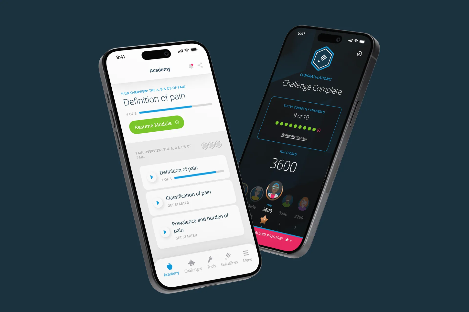
A leading pharmaceutical company wanted a mobile app to teach pain management professionals the latest methods for treating chronic pain conditions. The audience ran from doctors in training through to practitioners with decades behind them, so the UI had to be clean, scalable and accessible without talking down to anyone. The content was dense research material; the job was making it digestible, and making the learning stick.
The work
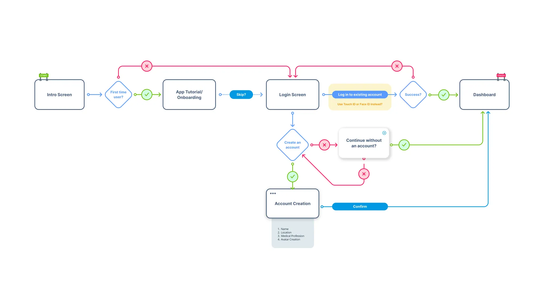
Let’s be honest: studying in your free time is rarely anyone’s idea of fun. So we made it a game. Each learning module got its own tailored mini-game, with scores feeding a regional leaderboard. That voluntary competitive edge kept people coming back, and badges at the end of each completed module gave the learning a finish line worth crossing.
To stop the app feeling heavy, I added avatar customisation to the profile area. Expressions, accessories, outfits. A small thing, but it let users put some of themselves into a clinical product.
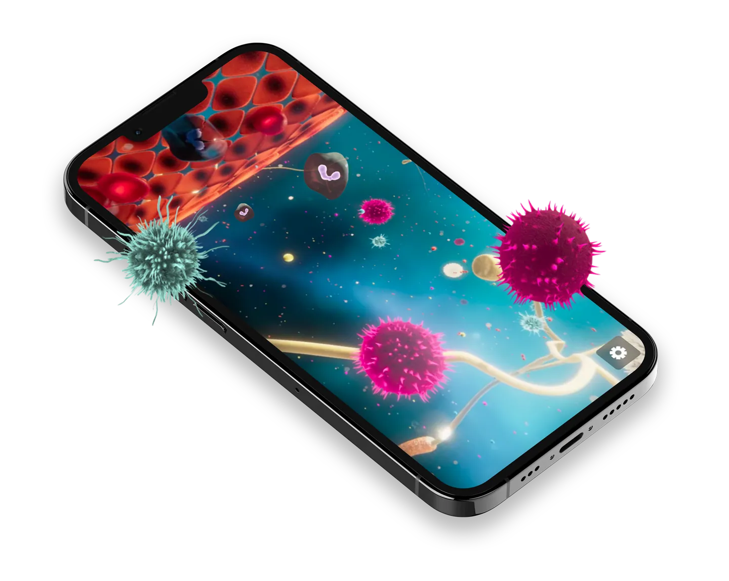
The most technically interesting part was the Mode of Action content. We built 3D animated models of specific pain mechanisms that respond to the gyroscope and touch gestures, so a practitioner can turn a mechanism over in their hands instead of squinting at a static diagram.
The result
The foundation of it all was ruthless content organisation: research broken into modules you can finish in a sitting. The gamification sits on top, validating the learning while keeping the journey genuinely enjoyable. Education apps live or die on whether people open them twice. This one earned its second opens.