Background
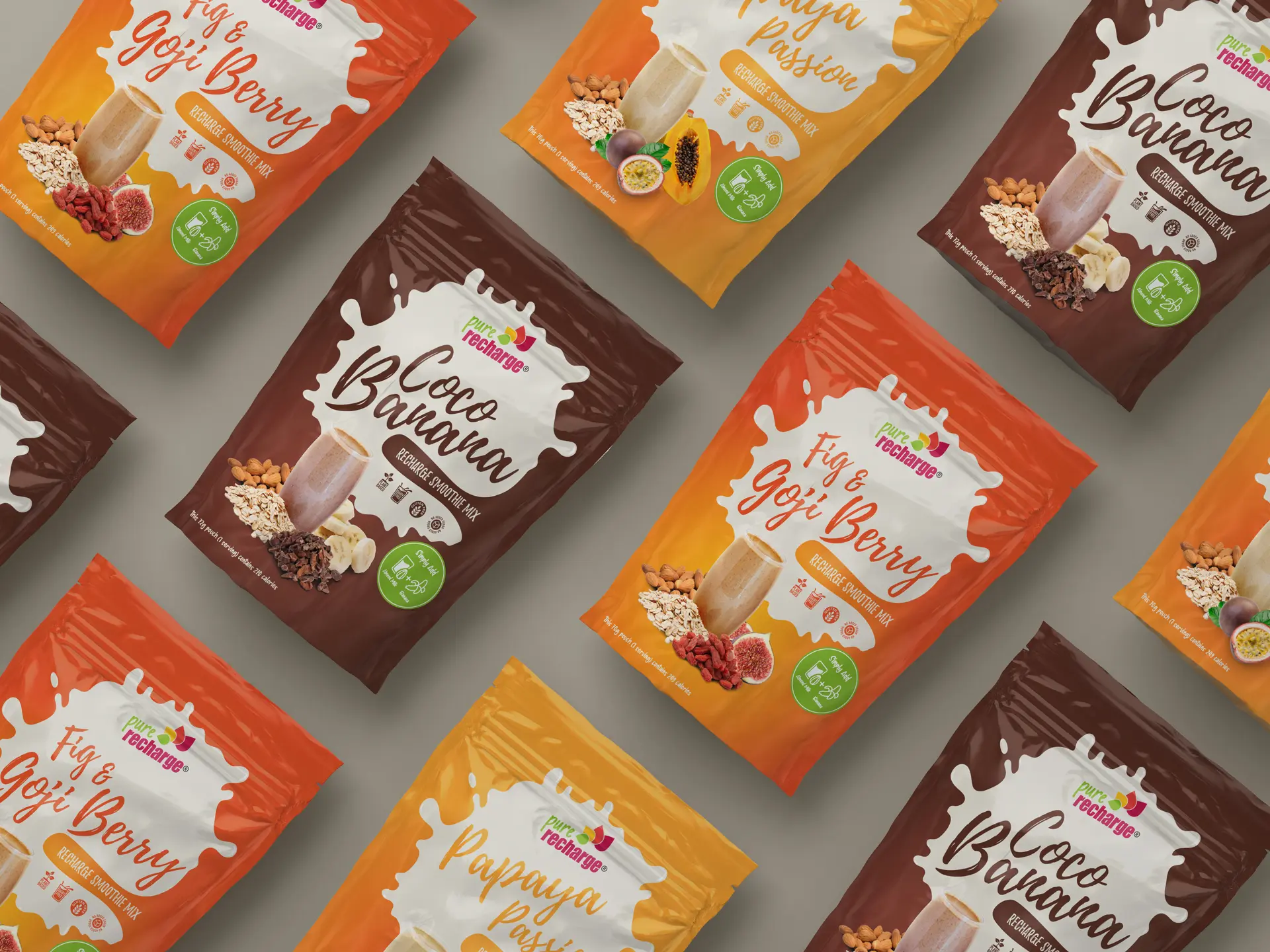
Pure Recharge came to me for a new look for their smoothie packaging: something fresh and bright in a market that mostly isn’t.
Two requirements were fixed from the start:
- The ingredients had to be displayed prominently on the front of the pouch.
- Each pouch’s colour had to complement the smoothie inside it.
The work
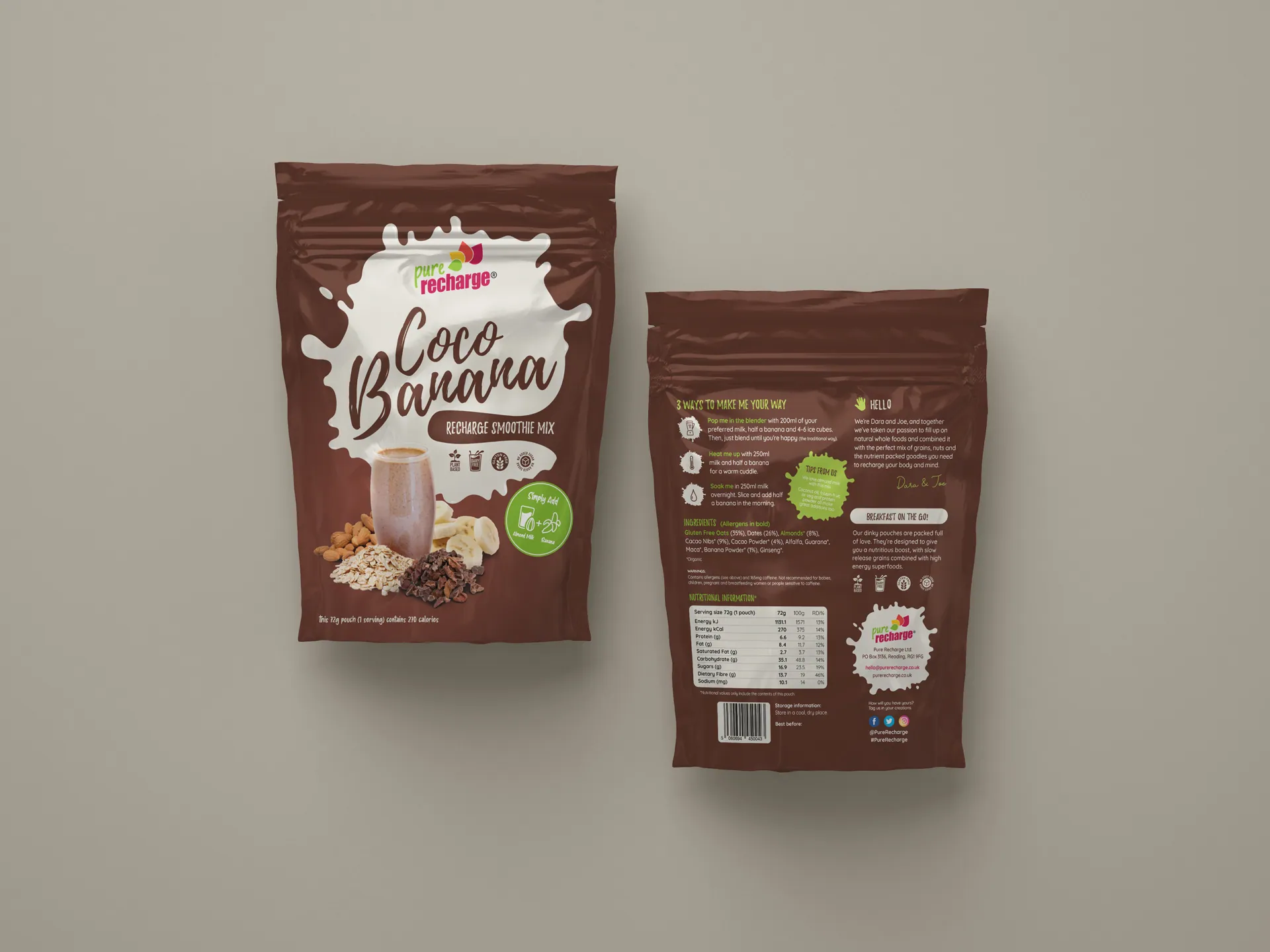
I surveyed the competition’s packaging and found shelf after shelf of dense, busy imagery. That settled the direction. I went minimal, giving the ingredients and the product room to sell themselves instead of shouting over them.
The splat graphic from Pure Recharge’s branding became the connective thread, running across the smoothie pouches and carrying over to the açai sorbet and nice cream ranges, so the whole family reads as one brand on the shelf.
The result
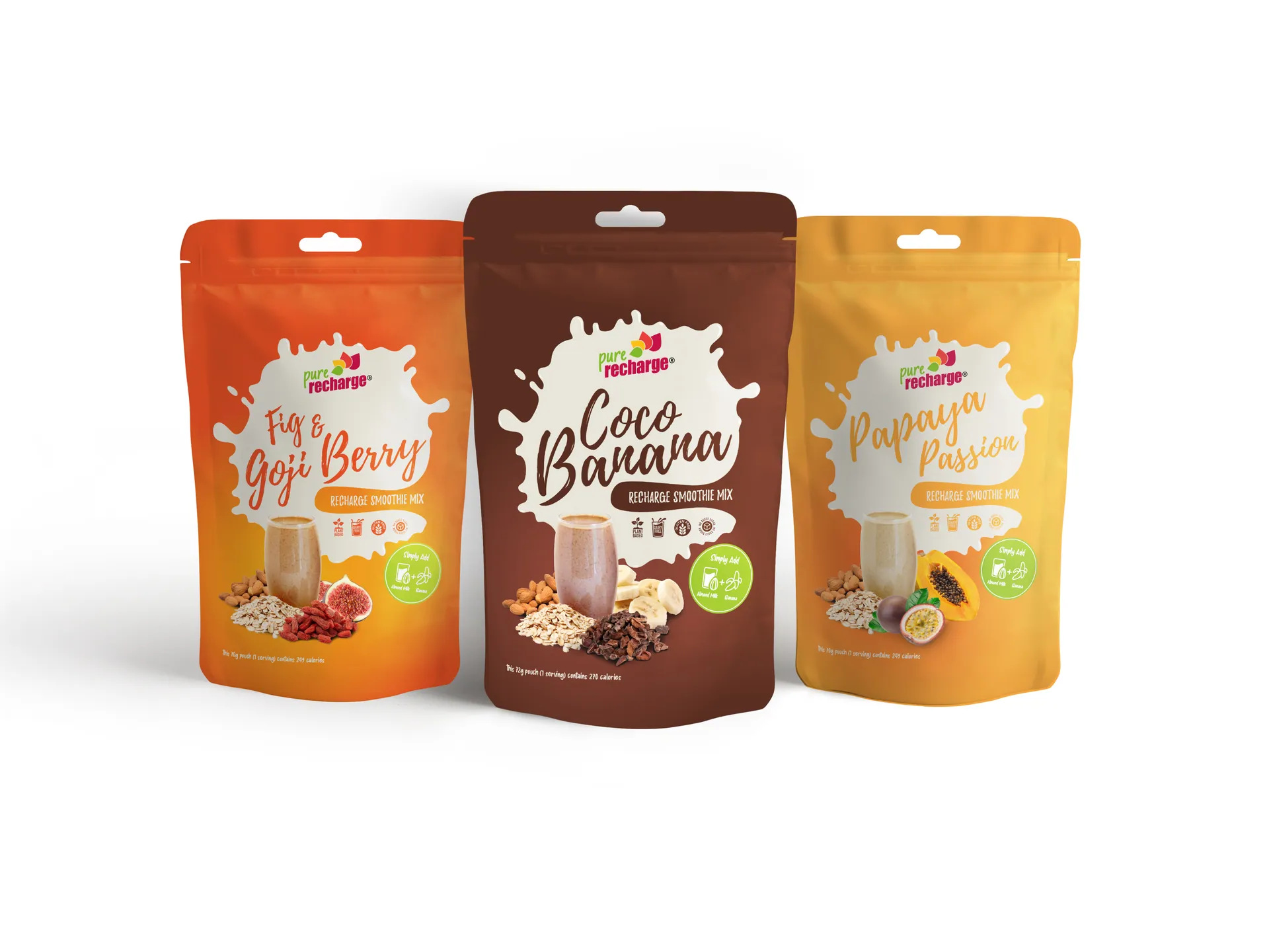
The finished pouches gave these smoothie mixes a proper identity, brighter and more confident than anything beside them. I was chuffed with the outcome, and so was Dara at Pure Recharge, which is the review that counts.